-
AuthorPosts
-
2 March 2023 at 11:14 am #1340
 mp_Participant
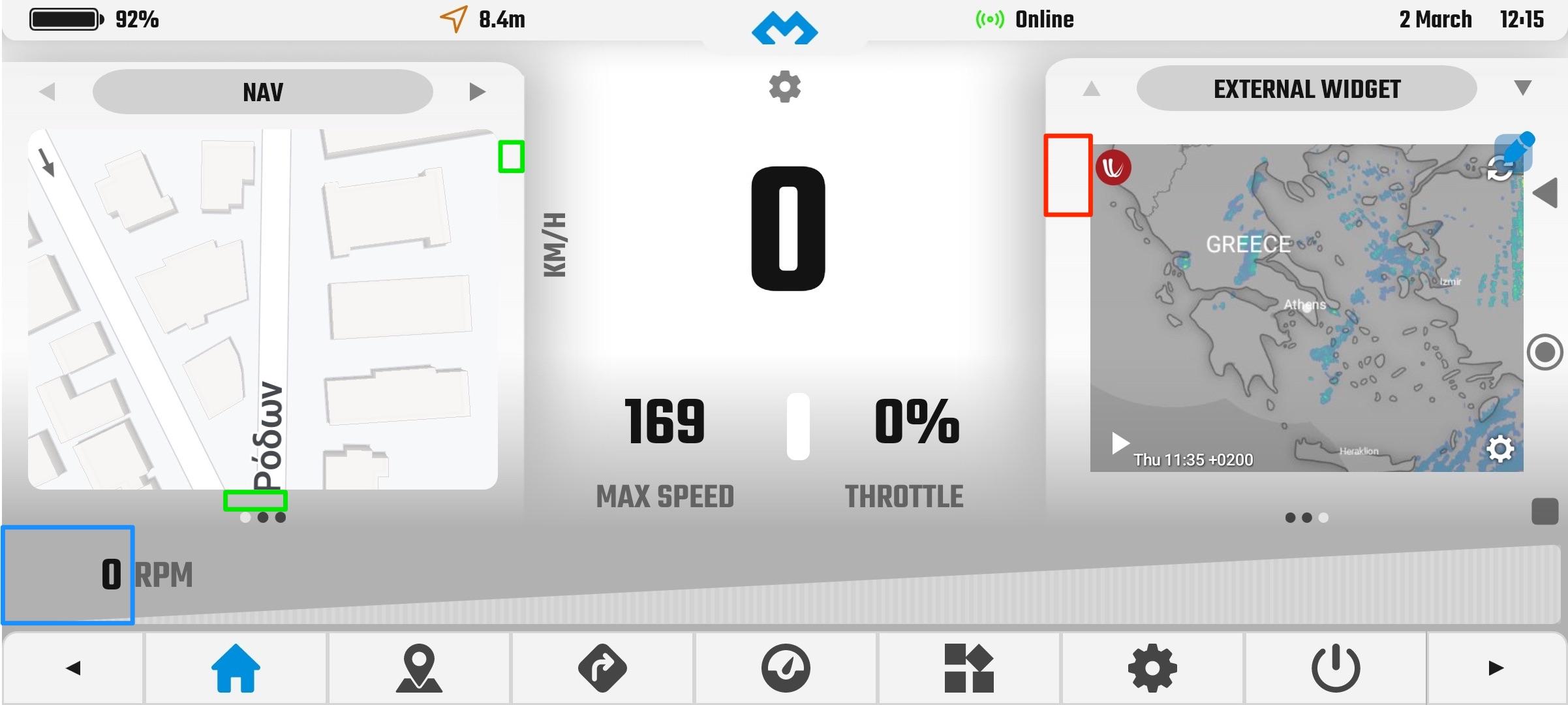
on v2.93 I really liked that the bottom column was not there, rmp indicator (blue rectangle), I had more height on the other columns/widgets, which was better. I know that you said you’ll add two layouts, one with all the columns and one with two, but would be nicer if I was able to select what to display, like the non beta dmd2, which you can choose the columns based on the widgets you have, so If I don’t add anything on the left column then I’ll have two and so on.
It is possible also to reduce a bit the margin on the column (green rectangle), the red one, which has a big margin, is from the widget I would assume?
 2 March 2023 at 11:37 am #1341
 João PereiraKeymaster
on v2.93 I really liked that the bottom column was not there, rmp indicator (blue rectangle), I had more height on the other columns/widgets, which was better. I know that you said you’ll add two layouts, one with all the columns and one with two, but would be nicer if I was able to select what to display, like the non beta dmd2, which you can choose the columns based on the widgets you have, so If I don’t add anything on the left column then I’ll have two and so on. It is possible also to reduce a bit the margin on the column (green rectangle), the red one, which has a big margin, is from the widget I would assume?
There will be options to hide sections for sure, like hiding bottom and even panels, maybe even a quick toggle between two totally different layouts. Just have some other priorities at the moment.
As for the margins they are indeed from your widget. Ill check if I can decrease the green margins too.DMD2 Project Manager & Lead Developer
Buy Me a Coffee2 March 2023 at 11:57 am #1342 mp_Participant
on v2.93 I really liked that the bottom column was not there, rmp indicator (blue rectangle), I had more height on the other columns/widgets, which was better. I know that you said you’ll add two layouts, one with all the columns and one with two, but would be nicer if I was able to select what to display, like the non beta dmd2, which you can choose the columns based on the widgets you have, so If I don’t add anything on the left column then I’ll have two and so on. It is possible also to reduce a bit the margin on the column (green rectangle), the red one, which has a big margin, is from the widget I would assume?
There will be options to hide sections for sure, like hiding bottom and even panels, maybe even a quick toggle between two totally different layouts. Just have some other priorities at the moment. As for the margins they are indeed from your widget. Ill check if I can decrease the green margins too.
Excellent, thank you.
-
AuthorPosts
- You must be logged in to reply to this topic.

